Previously, on Letterpunk… part three!

As promised last month, here’s another set of samples from my archive of lettered material. A peek, if you will, at the body of work done by your favourite comic book letterer for hire!

For this batch of pages, I opted to showcase some work which focused more on varied caption and balloon styles. It’s my personal opinion that some of these pages show best how I approach projects with a view to producting a cohesive sense of design across them. Sometimes these get tweaked a bit as a result of a client’s input, and sometimes I get to play about with different ideas to my heart’s content.

One or two of the pages here show off material from some quite demanding projects, where I had to develop alternate caption styles to suggest different character voices and such. Always tricky to do without overblowing things. But I wouldn’t be showing them here if I didn’t think they worked!

Might as well Jump!

Hey folks – hope everyone’s staying safe out there!

I’ve not shared any new work on this blog for a while, so I figured it might be a very good idea to update with a peek at a few books I’ve worked on recently.

First up is an important one. Well, ALL of these books are important, really. Folks need entertainment in these trying times. But I’ll lead with Rylen Grant’s The Jump because it currently has a campaign underway on Kickstarter.

I’ve worked on a number of projects for Rylend in the past, most notably his hit series Aberrant, which is currently in development for television. And The Jump carries the same vein of gritty storytelling applied to quite drastically different subject matter. It’s a very cool book. But don’t just take my word for it – check out these preview pages!

Art by Fabio Alves. Colours by Edson Ferreira.

If you’d like to give Rylend a helping hand in funding the book’s production, you can check out the Kickstarter campaign via this handy link:

QUICK EDIT: The pages for the book below are a bit of a sore subject with me. The creator is someone I’ve worked on a few books for in the past, but given that they now seem happy to promote ComicsG*te creators online, I’ve decided I’ll no longer be working for him. I can’t in good conscience work on material that could be seen to be aligned with a group that has been responsible for the harrassment of people I know within the comics industry. I’ve opted to leave the work here just as a sample of the work I can do.

And last, but by no means least, here are a few pages from issue #5 of Todd Vicino’s Power Broker – a book I’ve been lettering for release through Comixology. It’s a cyberpunk tinged tale of superpowers gone awry, and Todd’s packing a lot of fun ideas into it.

Comixology seems to be taking longer to process submissions of late, so I’m not sure if this one’s available there as yet. If not, call this a preview, I guess. You could always check out the previous issues!

Quite a work-out, this one. Power Broker is JAM PACKED with strange and outlandish characters, and this issue saw me lettering sound effects hand over fist.

Art by Jon Kutzer.

If that looks like something you’d like to read in full, head on over to Comixology and give Power Broker a look!

That’s all for now. Until next time, stay safe, keep healthy, wear your seatbelts, don’t walk down dark alleys at night, and don’t by an HP Netbook. Mine’s just borked and took me all weekend to fix.

Bored during lockdown? Have a free comic!

Howdy ho, chums and pals!

The world’s a pretty weird, occasionally scary place right now, what with COVID-19 drastically altering our way of life. Here in the UK, the current guidance is to not leave our homes unless it’s absolutely necessary, and I’ve seen a lot of folks on social media struggling to deal with the lockdown.

So, lately, I’ve been thinking of ways I can do my bit to help folks through it all. And the best idea I could come up with was to hand out some free entertainment!

Hence, I’ve got something here to share with you all in full. Here’s the full 10 page story ‘A Star Falls’ – written and lettered by myself and illustrated by the inimitable (and BAFTA winning) Dan Harris.

If you find the pages hard to read at a glance, click on them and zoom in to get a clearer image. And HAVE FUN! That’s an order!


This story has a bit of a convoluted publication history. It was originally written way back in 2014 for the Multiverse small press anthology, which was a great collection of stories sold at Cardiff Comic Con. Huge thanks go to Terry Cooper for setting that up! It was later re-published (with a few tweaks to the writing, just to make things a bit punchier) in the highly respected UK anthology Paragon, run by Davey Candlish.

Dan and Davey both very kindly agreed to having the strip posted here in full. So the least I can do is direct folks to their work. If you like what you see here, you can find out more about Paragon (and buy full issues) here:

http://paragoncomic.blogspot.com/

And, if you like Dan’s art, you could always check out the comics he’s put out via Attic Studios, including The Cosplayer That Doomed the Earth, Druid Investigations and Lou Scannon.  Check ’em out here:

http://atticstudios.website/

There – that ought to keep you occupied for a bit!

But, if you need some MORE free entertainment and you’re all comicked out, there’s more! For the last couple of years now, I’ve been writing and producing a video game review show on YouTube, where I review whatever I can get my hands on, irrespective of age. Seriously – my Atari 2600 game reviews seem to go down rather well.

If you fancy giving that a look, you can find ‘HdE’s Totally Unoriginal Gaming Show’ here:

https://www.youtube.com/channel/UCVnBKYo3Lyand2miArsa1Ig

See you all on the other side of this, folks. Stay safe, wash your hands, and stay indoors!

Kickstarter update: Costumed heroes and battle unicorns for hire!

Well, it’s been an absolute AGE since I’ve updated this blog – partly thanks to the fact that I’ve been kept pretty busy with lettering lately. 2019’s also thrown me a seemingly never-ending succession of curve-balls and crises as well, so I’ve been kind of coasting along for a few months. But it occurs to me that I haven’t shared any samples of recent work or pimped any new projects recently. So I guess now is a s good a time as any to rectify that!

I’m currently attached to three projects that are currently mid-way through their crowd funding campaigns, so I think it’s high time I killed a whole flock of birds with one stone by publicising them and showing folks what I’ve been doing on them.

First up is Russell Brettholtz’ SIDE-KICKED VOL 2 – a continuation of the excellent ‘capes with a twist’ superhero series he started a couple of years ago. This new arc picks up pretty much directly from where the last run left off, and working on a few show-and-tell pages for the campaign was like spending time with old friends. It’s good to see this one back – but it needs your support!

Side-Kicked Vol 2 promises to be completely accessible to new readers. You can find the Kickstarter here:

And here are some sample pages!

Next up is Andrew Clemson’s BETE NOIR – a book about a crime fighting avenger that has more than a hint of the much missed Darwyn Cooke about it. I’ve previously worked on Andrew’s STAR BASTARD series, which is currently ongoing through Scout Comics. This one’s set to be a highly individualised take on the genre.

Below are some sample pages – if you feel so inclined, you can show the book some love via this link to the campaign:

https://www.kickstarter.com/projects/153289885/bete-noir-1?ref=nav_search&result=project&term=BETE%20NOIR

And last, but by no means least, DECIMATING the comics landscape, we have Garret Gunn’s hilarious (and it really IS hilarious – trust me, I’ve read the script) WARCORNS: BATTLE UNICORNS FOR HIRE.

This is a spin off from Garrett’s popular Franklin And Ghost series, featuring a team of jarhead unicorn mercenaries who embark on an ill-advised mission to take down the two anti-heroes from that book. It’s basically the unholy end result of dumping G.I. Joe, My Little Pony, Garrett’s twisted sense of humour and a BIG dollop of military satire into a blender. And it is GLORIOUS.Here’s a link to the Kickstarter, and some pages to hint at the mirth contained within:

https://www.kickstarter.com/projects/1187267748/warcorns-combat-unicorns-for-hire?ref=discovery&term=WARCORNS

That’s all I’ve got for now, folks!

That Time I worked on a Comic For An Honest-to-God Movie Star

Well, true to form, it’s been AGES since my last blog update. We can thank all my awesome clients for that. Seriously, folks have been keeping me busy lately, with 2017 marking a landmark year in comics for Yours Truly. It all went by in a flurry of pages and script edits. And some nights, when I close my eyes, I can still see the Illustrator toolbars where they’ve been burned into my retinas.

In the midst of all this industrious lettering, I landed some really juicy gigs. And there’s one I thought would be a super-cool thing to share over here. Thanks to Source Point Press and writer Garrett Gunn (incidentally, one of the nicest guys I’ve had the pleasure of working with in the entirety of my freelance career) I actually managed to end up working on something for Billy Bob Thornton. That’s right – Bad Santa himself!

The project in question is a graphic novel starring Billy Bob’s band, The Boxmasters, in a tale of time travel, disillusionment and music. Featuring art by Stan Yak, the book is mostly rendered in monochrome. Just as an aside here, black and white comics can be very tricky to work on. When you don’t have the option of using colour, it can make it tough to work things so that they pop off the art. It’s a good test of your eye for making clear placements. And there’s also a fair variety of different things I had to convey with the lettering on this one as well.

Here’s a handful of pages that I remember being the most fun to work on.


The Boxmasters can be purchased directly from Source Point Press via their online store.

(Please note – I can’t answer any questions as to whether Billy Bob is nice in person, because I never spoke to him during production. Shame, because I would have liked to ask him if Cate Blanchett is nice in person. Have you ever seen Bandits? You should totally see Bandits. They’re both great in that film!)

What’s the standard font size for comics? Answers revealed!

Making a break with the previous pattern of blog updates, which generally lead to me showing off sample pages from recent projects, I thought it might be beneficial to put together a shorter entry to answer a question I get asked frequently.

Two or three times a year, and sometimes during the production process on a comic, somebody will ask me “what’s the standard size for comic book lettering?”

This is one of those questions that you’d think would have a simple, straightforward answer. But in reality, it’s a bit more involved.

Simply put, there’s no such thing as ‘standard font size’ in comic book lettering. And that’s down to a few different factors.

Basically, what you need to understand is that the settings for point size (which describes how tall letterforms within a font will be) and leading (which describes how much space will appear between stacked lines of text) are set numerically within the type handling window of Adobe Illustrator, or whatever vector drawing software a letterer is using.

Below is a graphic which shows how three different, commonly used comic book typefaces look when shown alongside each other. In each example, the point size and leading are set to the same numerical values in Adobe Illustrator’s type handling window. But notice how different they all look.

So, this means that on each new book, a little bit of time’s going to be taken over addressing this issue by necessity.

It should be noted that there’s no hard, fast rule about how the size of a font should be set in a comic. But some common sense decisions can be made. If the font is too large, then it raises the question of whether balloons are obscuring more artwork than they need to. And likewise, a font shouldn’t be reduced to too small a size. However, it’s important to note that, unless it’s in the service of creating a specific effect (like whispering, or shouting) the lettering for dialogue balloons should be kept at a consistent size throughout. Every once in a while, I’ll hear from another letterer that they were asked to reduce the point size of text to make a wordy balloon fit in a panel. Or punch up the point size in another balloon imply to make it fill a large area of dead space in a panel. That’s not done.

If you’re worried about setting the size of balloon lettering suitably for your own comic project, you could use a trick I’ve relied on in the past to work it out. Simply scan a page of a comic you like the lettering design of into your computer. You’ll have to crop this and tidy it up in Photoshop, but that’s nothing to worry about. Just aim to crop to the edges of your scanned page as tightly as possible.

What you need to do then is drag this scanned page into your graphics app of choice. You’ll need to manually resize it so that the edges line up with the edges of what will be your final printed page. It should go up to the edge of the bleed area of your print template, if you’re using one (and you SHOULD be!) but NOT into the outer trim area.

You can then place your lettering onto the page on another layer and manually adjust it until it matches the point size and leading of the lettering on your scanned page.

This will ensure that, provided the lettering on the page you’ve scanned is easily legible, yours will be too. (Amusingly, somebody once passed along a comment from somebody that they found my lettering on a book I’d set up like this to be ‘too small’ – if that’s the case, that reader is probably struggling to read books published by Marvel, DC, Dark Horse… you get the picture.)

One final point that’s worth making here is that it’s sometimes a good idea to boost your point size by a point or two if your project is a web comic or other online-only kind of thing. Sometimes, for reasons I’m not clever or technically savvy enough to explain, what looks good on a printed page doesn’t often look so good on a monitor screen or tablet. Post production processes can render text that would be clearly legible on a printed page borderline illegible.

I hope all the above is useful!

Save

Kickstarters a go-go!

So, it’s been ages since my last blog update. And with good reason – I’ve been flamin’ busy!

2016’s proven to be a pretty full year for yours truly when it comes to lettering comics. There have been times where I’ve felt like I was coming perilously close to overload, but somehow (mostly through injecting coffee straight to the brain via my eyeballs and going without sleep) I’ve managed to stay on top of it all.

A by-product of this busy schedule is that I seem to be getting a lot more work on books that are being funded through Kickstarter. And a lot of these are popping up at the same time, which gives me a great excuse to show off some of the work I’ve done on each one. It’s also a neat opportunity to show how I’ve altered my lettering design across each one to suit it. Versatility is something I’m always  striving to develop as I letter more projects, and I’ve commented before about how each project teaches me something – no matter how small a detail – that helps me to benefit the next. As you might imagine, being this active gives me a a lot to add to my bank of experience, know-how and clever tricks.

Anyway! Onto the comics themselves!
(Please note that the pages featured in this update aren’t necessarily presented in sequential order – I’ve picked a few edited highlights from each one.)

1 – Asgard.
by Charles Ben Jones.

Asgard page 4-01Asgard page 5-01Asgard page 6-01Asgard page 7-01
Here’s a novel one! I sometime find myself wishing I’d get to work over a greater variety of art styles. As a fan of comics, diversity in visual styles and textures appeals to me. I get bored reading comics that all look the same. So when Charles Ben Jones asked me to letter a few pages of Asgard, it came as a breath of fresh air.

As you can see, Charles is riffing on the late ’80s – early ’90s look that characterised mainstream comics of the era, with an eye on dynamism and drama. This pushed me to adjust a lettering style I had developed some time earlier, which a lot of folks are now asking me to use on their comics. I’ve tried to ape the best of that period’s hand lettering – which was already becoming less easy to find as digital lettering became the industry norm –  and give it my own twist.

At the time of my putting this post together, the Asgard Kickstarter isn’t live just yet. But you can find out more about it via this Youtube video:

https://www.youtube.com/watch?v=2e4Wafdvlh0
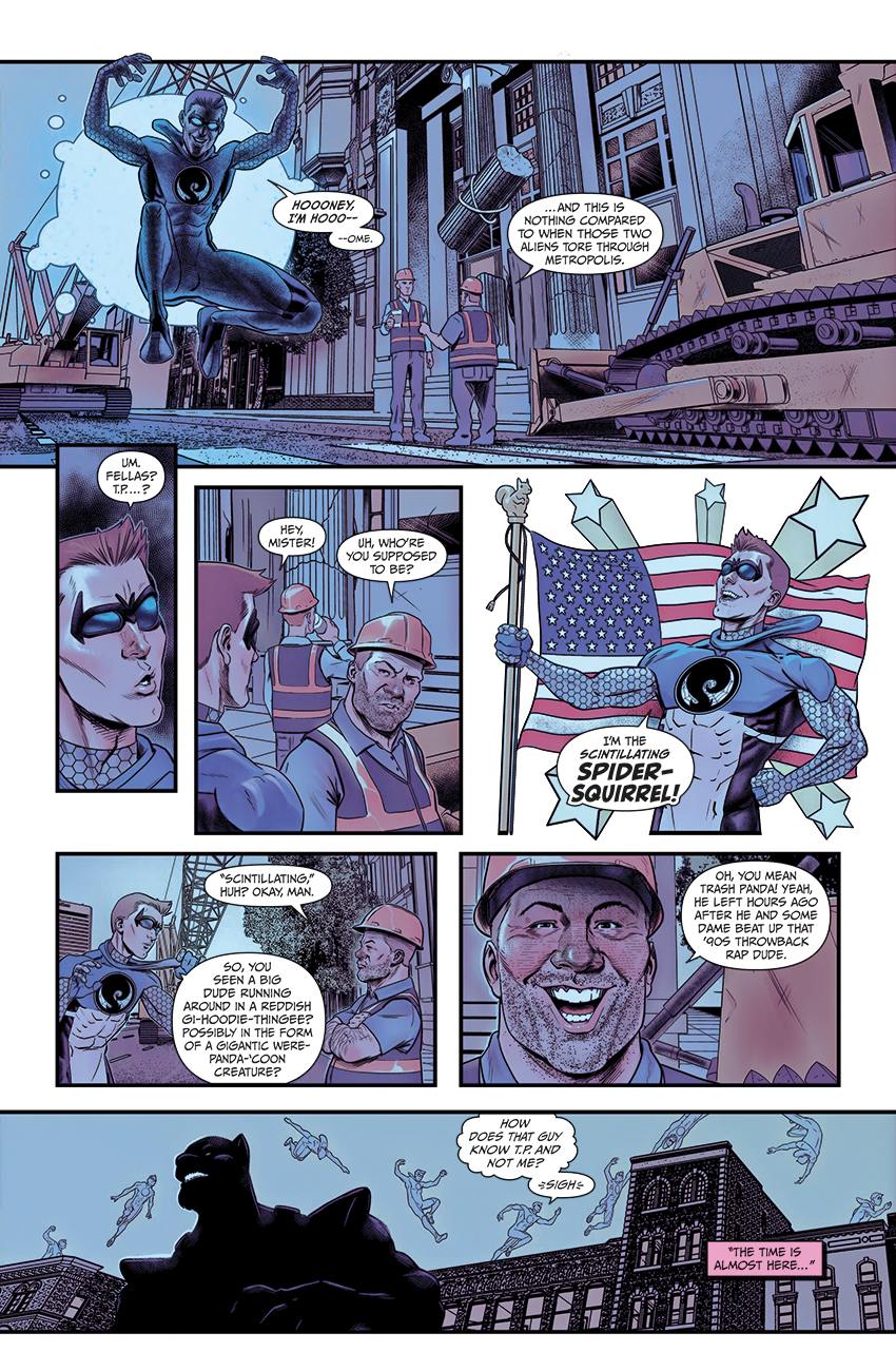
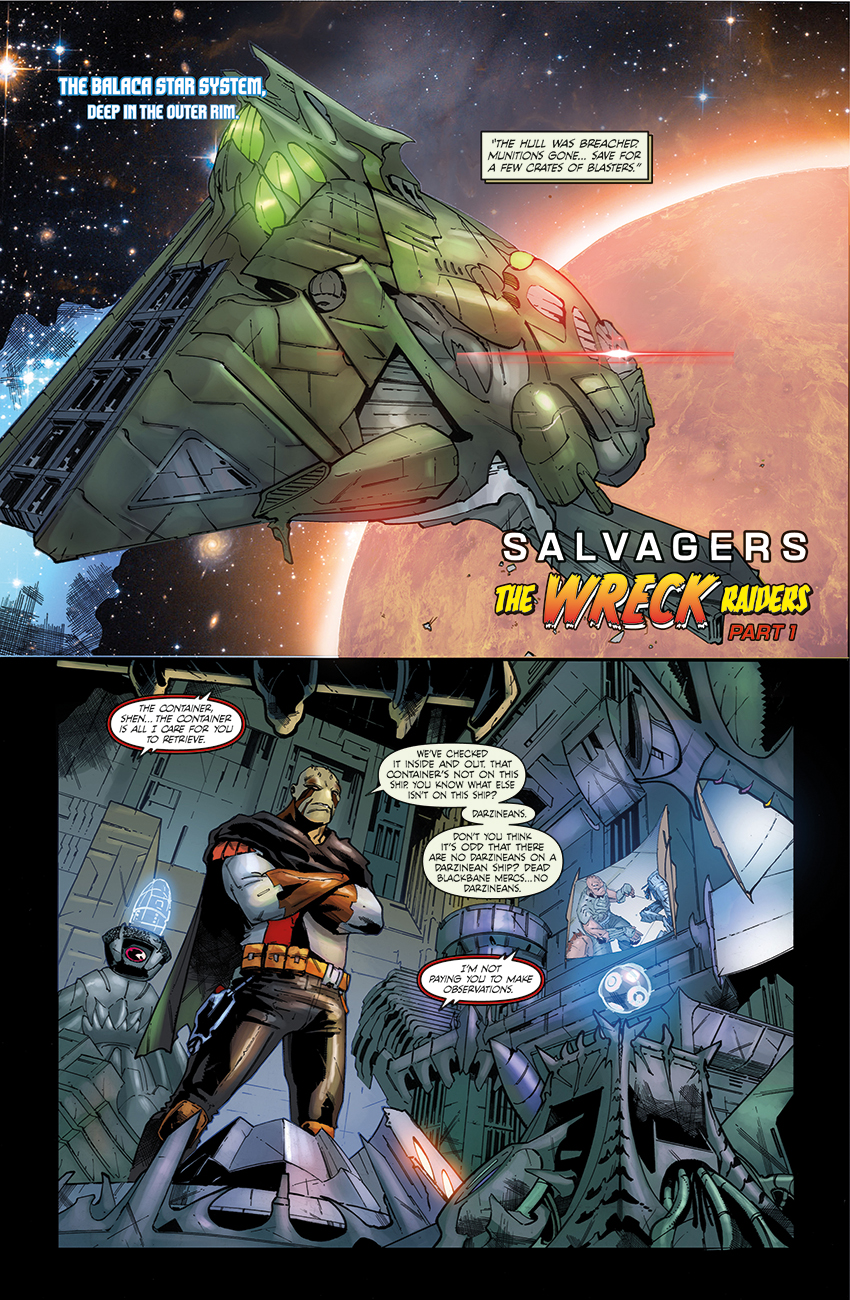
2 – Star Bastard.
written by Andrew Clemson.
Art by Jethro Morales.

Star Bastards #1 page 2Star Bastards #1 page 2Star Bastards #1 page 2
Andrew was kind enough to contact me about lettering this one after seeing examples of my work on social media. And with a title like that, how could I resist?

Star Bastard is a foul-mouthed space adventure featuring a bunch of central characters who very clealy hate each other, yet find themselves brought together by their own common indecency and, er… lack of values. Or something. If you enjoyed Guardians of the Galaxy, you’re sure to find this one taps a similar (if more abrasive) vein of humour and adventure.

The only trouble for me is that, Guardians of the Galaxy being a Marvel comic, and with Jethro’s artwork already stacking up frightentingly well with the talent pouring out of the House of Ideas, I have to bring my best ‘mainstream comics lettering’ game to the table.

Issue #1 is already available to buy. You can support the Kickstarter for Star Bastard here:
https://www.kickstarter.com/projects/844347291/starbastard-issue-1?ref=nav_search

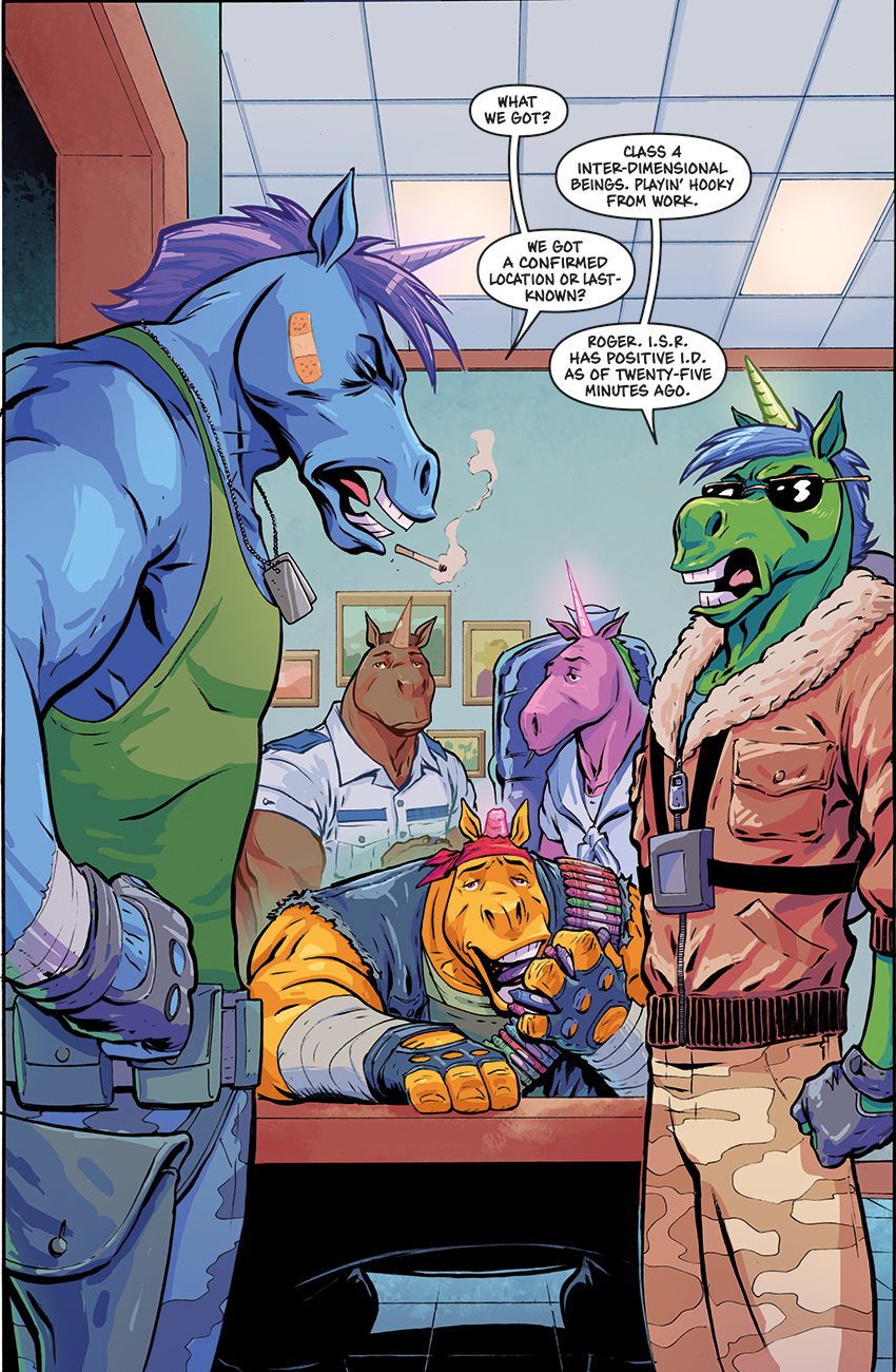
3 – Lights, Camera, Jungle!

Written by Tom Hutchison.
Art by Jenevieve Broomhall.

Shahrazad_03_01 CMYKLCJ #1 page 4

I haven’t featured any work from new Big Dog Ink books on this blog in too long. It’s a good feeling to be back in the saddle working for Tom Hutchison, easily one of the most clued up creators when it comes to ensuring his books have the best production values. Since BDI’s merger with Aspen comics, I’ve been assisting him with the repackaging of older, classic books like Sharazad (which is substantially different in its Aspen published form) and Legend of Oz: the Wicked West. But, like Joan of Arc which preceeded it at the start of the year, this is all new.

One of the things I really dig about working for Tom is that he always has a clear idea of the overall  character he wants his books to have. And usually, that boils down to making them fun, lively reads. Tom also knows how important lettering design is when it comes to nailing the appropriate look and feel for each book. So I’ve always got the appropriate guidance I need before getting started.

Extra added bonus on this book: I finally got to letter over BDI cover artist Jen Broomhall, whose work I’ve always enjoyed a great deal. As you can see, this book is an absolute beut!

You can find the Lights, Camera Jungle! Kickstarter here:
https://www.kickstarter.com/projects/1016186425/lightscamerajungle?ref=discovery

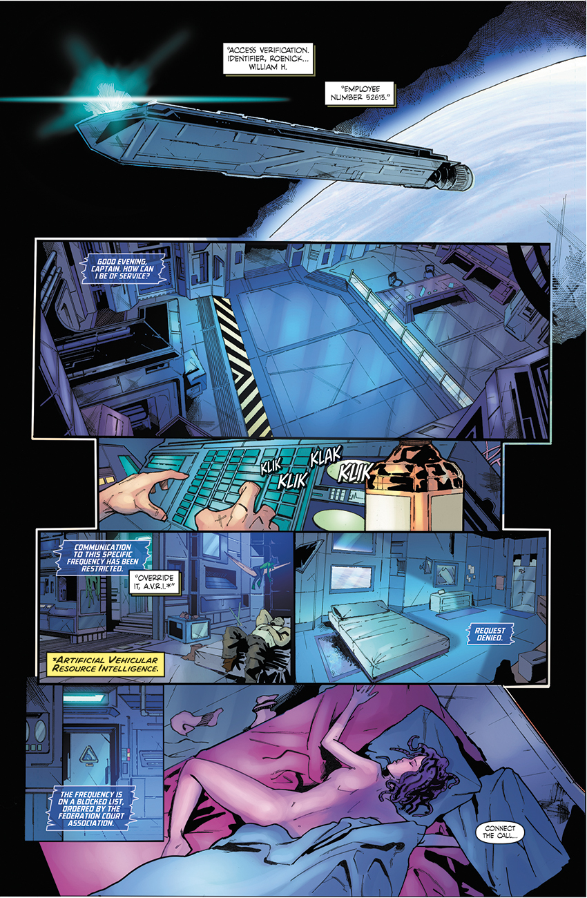
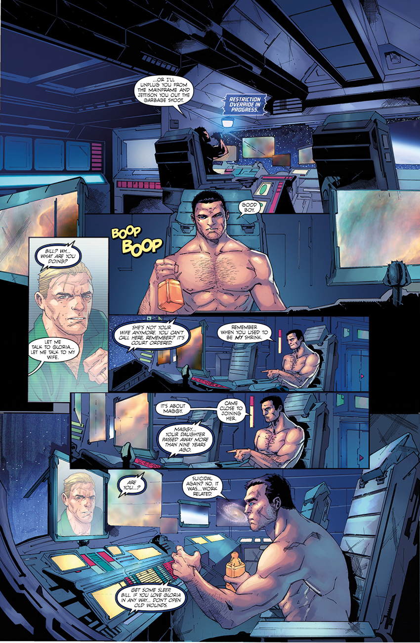
4 – Tales of the Extraordinary.

Written by Dale Styler.
Art by various.

Here’s a selection of isolated pages from the short stories appearing in this anthology:

Bathala Rising p06-01 Kid Chimera p02-01 Saudade p01-01 Reckless p02-01

Well, here’s an interesting one. Dane Styler is an indie creator who found himself in a bit of a pinch. His anthology needed to be lettered in full on REALLY short notice, and his previous letterer was unable to complete the work, meaning he was left with an entire book and a span of just days to get it done. After answering the flashing red HdE Emergency Phone (which is totally NOT a rip off from the old ’60s Batman TV show) I agreed to take it on, did some drastic shifting around of things in my schedule and went without sleep for a few days to get it done.

Sounds like hard work, yeah? Well, yes it was. But it also gave me a chance to design lettering for several standalone stories and stand back at the end of it knowing that I’d lettered an anthology in full. I’ve been asked to handle full lettering and design for these kinds of projects several times in the past, but anthologies being what they are (if you’ve ever tried editing a group project, you’ll know what I mean) it’s never come off.

This time, though, the art and scripts were ready to go, meaning I simply had to retreive all the materials and have at them.

The anthology itself is Dane’s bold (and, I reckon, successful) attempt  at establishing his own set of alternative superhero characters. The art style changes from one story to the next, which keeps things interesting not only for readers, but for the guy lettering them. I had to devise complimentary lettering styles for each one.

The Tales of the Extraordinary kickstarter campaign will be live shortly.

Anyways, that’s all for now. I’m honestly feeling a bit frazzled after lettering all these pages! I’m going to disappear for a bit and dunk my brain in a bucket of ice water. Ooooh… tingly!

Save

Save

Salvagers – The Wreck Raiders

Well, it’s time for another sneak peek at a new book I’m working on!

Long time readers (yes, both of you!) will probably remember a post from a while back when I demonstrated what I’d done with Bob Salley and George Acevedo’s indie book SALVAGERS. Well, I’m pleased to report that not only did the series receive a recent trade paperback collection, but the second arc is already underway!

The creative team has changed up a little, with artist Chris Gevenois and colourist Fahriza Kamaputra giving this second chapter in the Salvagers saga a fresh look and feel. Here’s a five page preview of the book to give you a taster of what’s in the pipeline:
Salvagers issue #5  page 7Salvagers issue #1 page 21Salvagers issue #5  page 7Salvagers issue #1 page 21Salvagers issue #1 page 21

It’s genuinely exciting to be working on a book that’s not only winning acclaim and generating its own loyal fan base, but very clearly evolving on its own terms. But is the lettering evolving? Well… yes, actually! Albeit in a very minor, but significant way. When a comic enters a new phase of its ongoing story, it’s a logical place to start tweaking any small details that were bugging me before, or iron out any kinks. In the case of Salvagers, I was pretty much completely happy with everything I’d done. But there was one minor
alteration I made to the book’s lettering design which I think improves it considerably. I’ve reduced the width of the stroke on the dialogue balloons. It’s a seemingly tiny change, but just by matching the thickness of the balloon stroke to the heft of the dialogue font, I think this makes things look much better. It’s something trying to do with all my work as I move forward. I had a lot of fun with that title treatment as well!

Keep your eyes peeled for this one. It should be available soon in print and digitally via Comixology.

Faking it!

Well, it’s been an age since my last update. What can I say? 2015 has turned out to be a particularly busy year!

I decided that, this time, I’d update the blog with something I lettered some time ago, because it addresses a common prejudice I encounter a lot. For some reason, when dealing with inexperienced comic book creators, the idea abounds that digital lettering is somehow inferior to how it was done in ‘the good old days’.

I’ve even had a few big name artists from back in the day opine to me that that letterers should be using traditional, physical tools, as if the use of digital type and vector drawing programs somehow invalidates the work.  But this is a wrong attitude for several reasons.

I’m going to sidestep the issue, for a second, that good and bad work stems from good and bad craftsmanship irrespective of the tools used, and simply stress a few practical concerns. First of all, virtually NOBODY is lettering by hand in the modern, mainstream comic industry. There’s still a place for it, and I’ll be the first to say that well executed pen and ink lettering looks beautiful. Secondly, hand lettering is simply not that feasible in today’s business climate. Can you imagine how unnecessarily complicated that would make things? Pages are far easier to send to a letterer electronically for digital work, and given the continual perceived need to drive down production costs, it’s extremely unlikely that editors would want to  bother with the hassle of sending physical pages through the postal system. And before you start thinking about clever ways to get around that, it’s worth mentioning that there’s not much money in this job. If we were asked to print out pages and letter them by hand, that would quickly eat into the time and profit margin we have on each precious gig.

Lettering with a computer, then, is a wise choice just because it’s expedient. But it doesn’t mean that the results are guaranteed to be of a lower quality. Remember – skill and craftsmanship determines quality – not the tools. And a computer is a tool just as surely as an Ames guide or a dip pen is. All that fundamentally changes when lettering digitally is the approach to the work.

It’s at this point that I should mention BULLDOG AND PANDA, by Jason Cobley and Stephen Prestwood, which currently appears in the excellent PARAGON small press anthology. It’s a revival of the strip, having first appeared in a UK small press comic back in the 1980s. Paragon’s publisher, Dave Candlish, put out a call for a letterer for the second part of this continuation, and because I saw an opportunity to experiment with different lettering techniques, I jumped at it.

Here are a few isolated pages:

Page 2
Page 2
Page 2
The timing here couldn’t have been better. I had  been thinking for some time about ways of making my lettering look more lively and organic. There truthfully IS a trap you can fall into with digital work whereby it starts to look clinical and sterile, and this is something I’ve been trying to steer clear of in all the time I’ve been lettering professionally. In truth, for a while, I’d been pondering ways to make my work look more like it had been executed with pen and ink.  So a new project with a distinctly old-school vibe to it was just the spur I needed. I dug out some reprint material of old 2000AD strips – Judge Dredd, Nemesis the Warlock, A.B.C. Warriors – and collected volumes of Marvel UK comics such as Transformers and Dragon’s Claws, and started to examine them studiously. These comics were chosen specifically, as the production methods of the day were pretty hands-on. I had gotten used to lettering in a very regimented, almost mechanical process of creating perfect balloon shapes and uniform blocks of text. What I was looking at in these older comics was much more organic. Slowly, I started to work out what the components of that aesthetic were, what made it work, and what parts of it I could convincingly ape.

There were two key aspects I focused on with this project: balloon shapes and type dynamics. The balloon design is probably the easiest part of the process to describe, so I’ll go with that first.

When lettering digitally, coming up with an attractive balloon shape is one of the most important aspects of page design. This is one of those things that IMMEDIATELY indicates the difference between  an experienced letterer and a beginner. Too many digitally lettered comics at indie and hobbyist level feature ugly, mechanical ellipses drawn with a marquee tool and left unfinished. Modern comics feature much cleaner, more rounded and attractive balloon shapes, and these are easy to produce in cookie cutter fashion in vector drawing software.

BUT… do you necessarily want that perfection all the time? Given that the aim here was to mimic the look of an old 1980s UK comic, that point was debatable. Looking back at comics of that era, the lettering was often characterised by irregular balloons which were very obviously drawn with a pen and ink. Hence, I decided to alter the curves of my standard balloon shapes in Illustrator, creating several variants that I could repurpose across multiple pages. I also introduced some subtle  variation into the line weight of the balloon stroke, to simulate the irregular flow of ink from an overworked and poorly maintained tech pen. No disrespect to letterers from that era – I’ve owned Rotring pens from that period, and they were always horrible, imprecise tools in my hands. Adding a little of the chaos those old, traditional tools used to introduce to the line, though, just sold the aesthetic a bit more.

Another trick I tried was a fake ‘paste up’ effect. Notice how the caption boxes have a reversed colour scheme in comparison to the traditional black on white of the balloons? This was something I lifted straight from Steve Potter’s work on early Nemesis The Warlock strips. To approximate the look of a hand applied caption, I placed a little sliver of white underneath the caption box and nudged it around slightly to look like a hasty and slightly imprecise scalpel job put in place by an art bodger. I even did this on a few select balloons as well, just to push that illusion a little further.

(‘Art bodger’ isn’t a derogatory term, by the way – it was a term used to describe people who worked in-house back in the old days who would carry out page corrections by hand.)

The final part of this particular design scheme is the type dynamics. This basically comes down to a simple trick, but it MUST be used carefully.

The best and most design savvy letterers of the ’70s and ’80s understood that a lot of creative mileage could be had by altering the height and thickness of certain select lines of dialogue . Pick up an old E.C. horror comic or an issue of 2000AD from all those years ago, and you’ll find that specific portions – usually just a few words, or even just a single one – were  rendered with a  thicker stroke. This adds a lot of character and drama to the dialogue, and it was something I REALLY wanted to put into BULLDOG & PANDA.

The biggest challenge at this stage was coming up with a font selection that would tolerate a bit of tweaking in each individual balloon, and also mesh with the irregular, hand drawn look. I have a fair number of dialogue fonts in my personal library, but trying to zero in on one that would fit this project was quite a test. Eventually, I found one which convincingly suggested the fluid penmanship of the best hand letterers, and a little fiddling produced results that I’m personally VERY happy with.

The final pages  became a real labour of love. While I’m not sure this exact approach would work for any comic, it certainly gave me a few new ideas about handling dialogue and designing pages, and I’m still experimenting with them on projects that call for it. Keep an eye on the blog, and I’ll show a little of them as time permits!